
Design review
Three homepage directions for Transworld Metal Works
Same content and brand palette in all three — maroon and steel gray. Open any option to view the full-length homepage, then tell us which direction to develop.
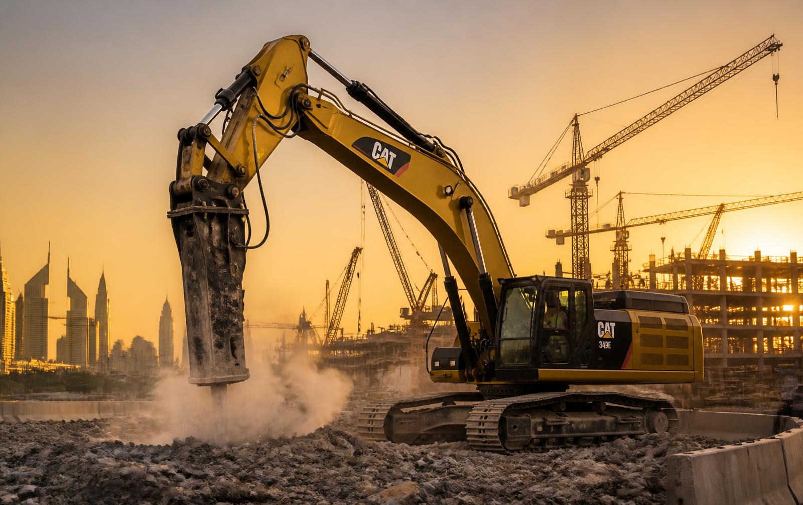
Option 1
Classic Corporate
Light, structured and trust-led. Diagonal hero split, icon service grid, project gallery and an embedded location map.
- Light theme
- Sticky header
- Square buttons
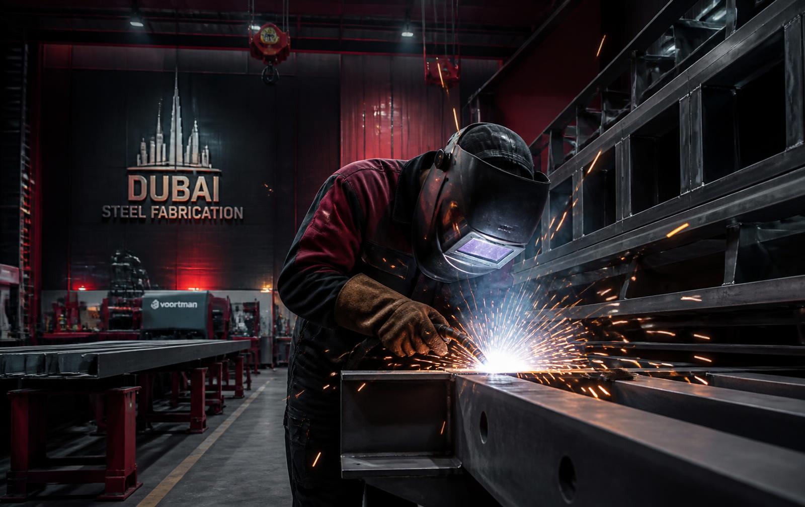
Option 2
Dark Editorial
Charcoal, typographic and confident. Split hero, numbered capability list and full-bleed photographic bands.
- Dark theme
- Big type
- Pill buttons
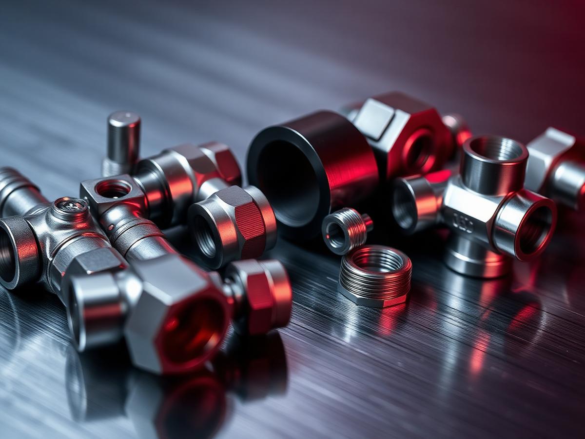
Option 3
Maroon Bento
Modular panels with a maroon anchor block, dark industries band and edge-to-edge equipment photography.
- Modular grid
- Maroon hero
- Rounded panels